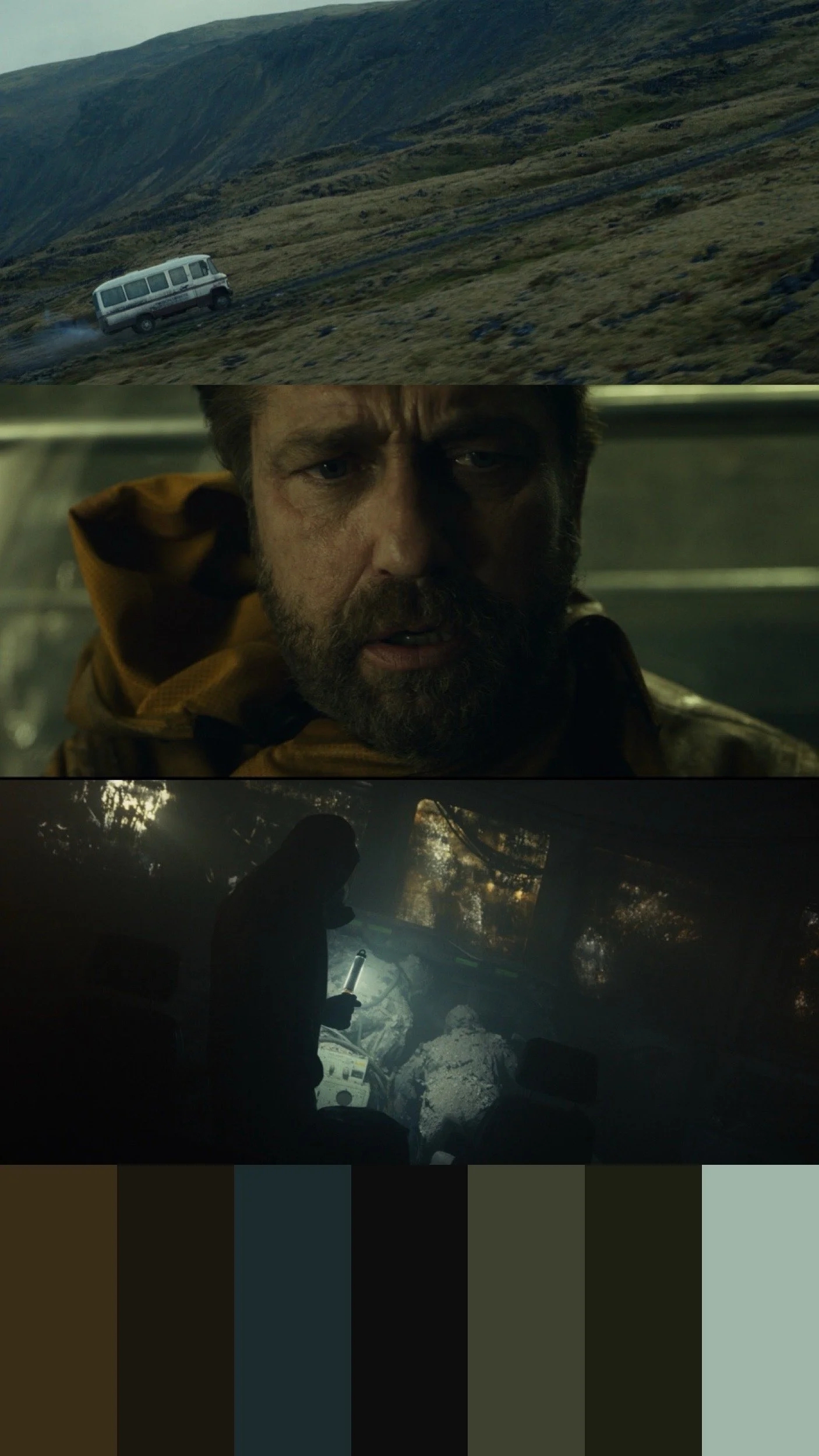
Greenland 2: Migration Color Palette
When we approached the color of Greenland 2, the goal was never sepia or “apocalypse orange.”We wanted the palette to feel earthy, but unsettled.Familiar colors, soil, stone, skin slightly skewed and restrained, so the world feels recognizable… but not quite safe.As the story progresses, color is slowly fed back into the image slowly tracking a return to life.That’s how color works best: Not announcing itself, just changing how you feel.
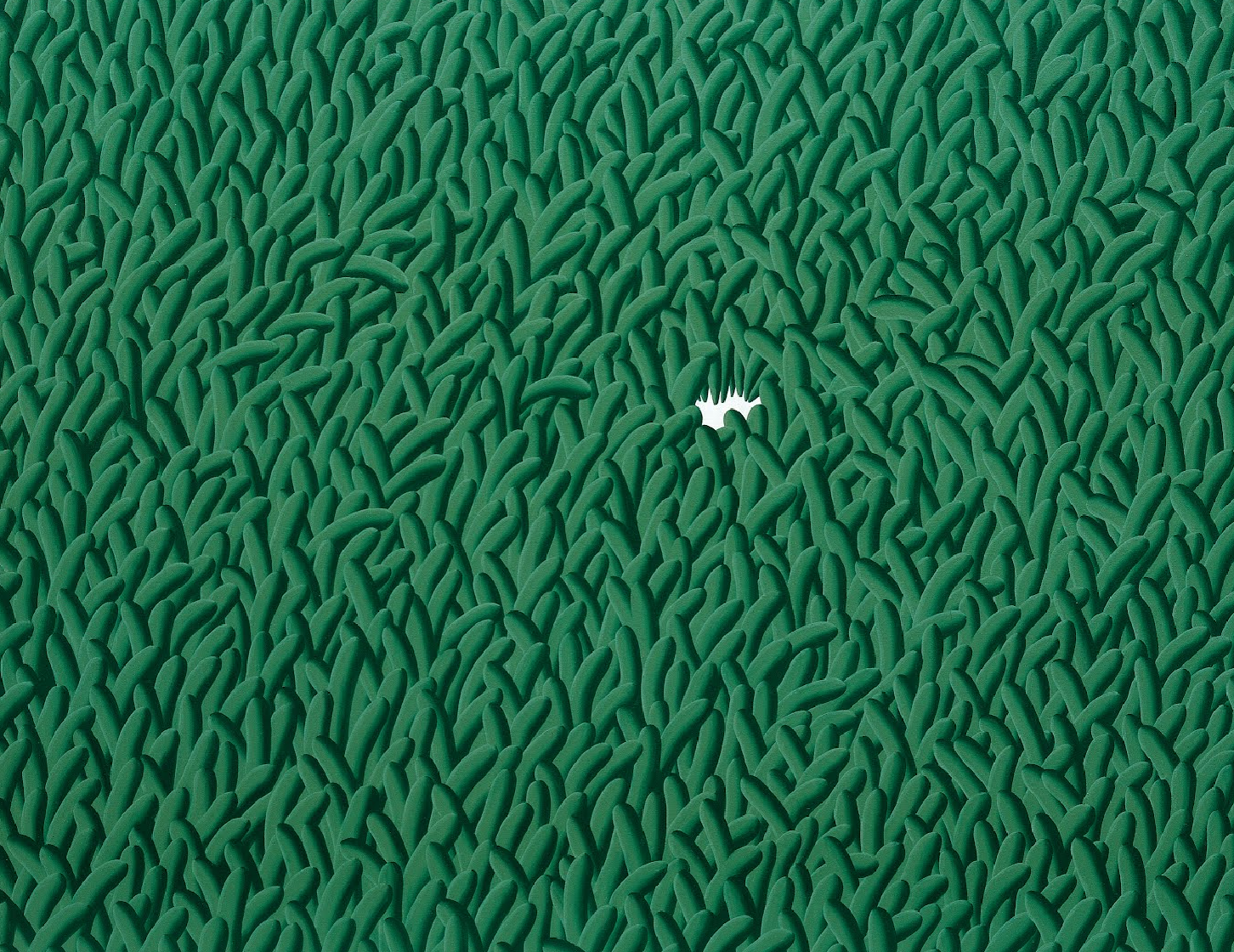
Eigengrau… The “intrinsic grey“
You think you’re seeing black but you’re not.It’s softer. Dark grey. A faint blue whisper.That’s Eigengrau “intrinsic grey” your brain’s baseline visual noise when no light at all reaches your eyes.* It’s why “true black” on screen can feel too black to be real. * It’s why crushing shadows can suck the life out of a scene. * It’s why leaving just a hint of texture in the darkness makes it breathe.Eigengrau is presence... the light your brain expects, even when there is none.

Film Review - Conclave
On Monday evening, I immersed myself in Edward Berger’s Conclave, a taut, atmospheric thriller that masterfully balances reverence with modern intrigue. Anchored by Ralph Fiennes as Cardinal Lawrence, the film unspools the tense proceedings surrounding the election of a new pope. Yet, what might sound like a staid premise is elevated by Berger’s deft direction and Stéphane Fontaine’s exquisite cinematography.
To simply call Fontaine’s work “beautiful” would be an understatement; it’s visually transcendent. The camera glides between divine, god-like overhead perspectives and intimate framing that recalls the grandeur of High Renaissance painting. Each shot feels purposeful, a painterly tableau that underscores the film’s meditations on power, faith, and human frailty.
What struck me most, though, was the interplay of the ultra-traditional—cardinals in ornate robes pacing the Vatican halls—and the refreshingly modern: secret texting, furtive glances, and even the casual lighting of a cigarette. This juxtaposition doesn’t just update the papal intrigue for a contemporary audience; it deepens the tension, reflecting the eternal collision between ritual and human imperfection.
Color plays a potent role in this narrative, particularly the omnipresent red of the cardinals’ vestments and the set design. The crimson hues radiate symbolism, evoking a visceral sense of sacrifice, ambition, and the blood-soaked struggle for power. Berger leans into these contrasts with confidence, letting the palette tell as much of the story as the dialogue itself.
Afterward, I found myself reflecting on an interview with Robert Greene, the author of The 48 Laws of Power. His ideas about the insecurities and self-serving motives that drive even the noblest-seeming figures resonated deeply here. Conclave reminds us that no one, not even those cloaked in holiness, is without their inner conflicts. Beneath the lofty rhetoric and solemn robes lie human beings, each wrestling with their own justifications for why their narrative—and their ambition—should prevail.
This film isn’t just a thriller about the election of a pope. It’s a meditation on the universality of ambition, frailty, and the eternal search for meaning in the face of our imperfections. A must-watch for anyone willing to sit with these questions, framed in the chiaroscuro of faith and human nature.
🔵 Exploring Color Theory and Afterimages 🟡
Curious how your eyes process colors? Try this quick experiment:
1. **Focus on the Blue Circle**
Stare at the blue circle in the first image for 30-40 seconds.
2. **Switch to the White Screen**
After 30 seconds, swipe to the second slide—a plain white background.
3. **Observe the Afterimage**
You should see a yellow circle. This happens because your blue receptors tire, and your brain shows the opposite color—yellow.
Give it a try and let me know what you see!


The 70’s palette with a twist
It’s always exciting to experiment with new ways to create a vintage look. In this film, the scene was set during the character's time studying in London.
Drawing from my experience living there, I avoided the usual magenta tones in the shadows. Instead, I introduced elements inspired by cold, dreary London, incorporating greens and lifted shadows like a faded photo.
We also used grain, halation, and a mix of blurring and sharpening to distress the image, enhancing its worn, nostalgic feel.

The Way Colors Make Us Feel
I've always been fascinated by the emotions we experience when looking at different colors. It's something hard to explain logically, yet we all feel it on an instinctive level. Recently, I watched an interview on The Tonight Show with Jimmy Fallon where comedian Julio Torres humorously impersonated how each color "feels." It struck me how, while we often struggle to describe colors in words, its easier to express the emotions they evoke.
There’s science behind this. Each color has its own wavelength and frequency, which can influence our perception. The longer the wavelength, the lower the frequency, as with reds, which tend to evoke a sense of warmth or urgency. On the other hand, colors with shorter wavelengths, like blues and violets, have higher frequencies. These higher frequencies are often associated with feelings of calm, creativity, or even spiritual elevation. The higher the frequency, the more energizing and uplifting its effect on our mind can be.
Of course, there are contradictions—context is everything. A candle flame, with its warm orange glow, has long wavelengths and might seem energizing, but in the right setting, it’s calming, even meditative. The same goes for a sunset, which fills the sky with reds and oranges, yet is often associated with peace, reflection, and the winding down of the day. It shows that while color has inherent properties, the way we experience it is often shaped by the environment and mood in which it’s presented.
Making And Matching
A fascinating concept in the creation of visual images—whether in painting, photography, or color grading—is the idea of “Making and Matching,” as first explained by the influential art historian E.H. Gombrich.
Making
The first effort in an artist’s creative process is “Making.” This begins with internal schemas—the mental templates that have formed in the artist’s mind over time. These schemas are shaped by the artist’s life experiences, cultural background, and the artistic traditions they are familiar with. For example, the way you saw a sunrise as a child might influence how you depict the warmth and tonal value of the sky in your work. When an artist starts creating, they rely on these schemas to “make” an image. This is the initial stage where ideas are translated onto the canvas, screen, or other mediums.
Matching
After the “Making” comes the “Matching.” This phase involves comparing the created image with the real world or a visual reference. The artist critically assesses their work, looking for discrepancies between their internal vision and the actual appearance of the subject. This process of refinement is continuous—a balancing act between the internal world of the artist and the external reality. There’s an ebb and flow between what the artist envisions and what is observed, a loop that can theoretically continue indefinitely. However, from personal experience, there comes a point where the work just feels right. Like churning butter, some things can be overdone.
The Ultimate Artistic Challenge
The Making and Matching process represents the ultimate challenge for an artist. It’s the struggle to harmonize the artist’s internal visions with the world we live in. When these two elements are balanced perfectly, they result in the most powerful artistic expression.
Color Grading The Film/Digital Hybrid Look
Every now and then, there’s a chance to combine the strengths of digital and film aesthetics, creating a look that serves its purpose while blending the best of both worlds.
This was the case for a recently released music video by Belinda, a Spanish-Mexican singer. When I first saw the offline cut from director Salomon Simhon, I noticed a range of possibilities for using color to shape the video. We could have taken it in a dark, moody direction or, given the striking visuals, opted for a vibrant, fashion-forward look. After discussing with Salomon, we decided that a more vibrant approach would work best.
Belinda’s skin tone was a key focus—it has an almost porcelain quality. The challenge was to add color and texture to the video while keeping her skin clear and natural. This led us to a film/digital hybrid look. The trick was finding the right balance: bringing vibrancy to the surrounding areas while maintaining her natural appearance. It was a process of fine-tuning, using subtle power windows and adjusting contrast levels to achieve a filmic look without losing important details. We also softened the image in certain areas to maintain texture without sacrificing clarity.
DP Rēy Zitrø’s careful control of the lighting gave me the flexibility to refine the brightness and shadows into the hybrid style we were aiming for. We avoided heavy grain except in a few key scenes where it added to the look. The same goes for saturation, particularly in the grave scene where we leaned into a 90s fashion-inspired aesthetic.
Color grading this music video was an interesting challenge, striking a balance between digital sharpness and the timeless feel of film. By carefully combining these elements, we created a video that captures Belinda’s unique presence while supporting the artistic direction of Salomon Simhon and the lighting choices of Rēy Zitrø. The result is a piece that feels both fresh and timeless, blending the best of both mediums.


‘The Sympathizer’ The 3 main colors used.
When developing the color palette for 'The Sympathizer', we focused on three main color tones. Firstly, we emphasized gold tones with hints of green. We felt these tones provided a vintage feel, evoking classic cinema. Secondly, we incorporated cooler green tones, particularly in uncomfortable scenes, using blue-greens to subconsciously make the viewer feel uneasy. Lastly, we used powdered blues to reset the viewer's eyes from the warmer tones. This not only created a nice juxtaposition with previous scenes but also kept the overall color palette interesting and unique. All 7 episodes of The Sympathizer are now available to watch on HBO MAX.

The Subjectivity of Color and Light
A straightforward way to demonstrate the subjectivity of color perception is by closing your eyes and gently pressing on your eyelids. When you apply this gentle pressure, you stimulate the cells in your retina, leading to the perception of flashes of color and light. Since your eyes are closed during this experience, the colors you see are not a result of external light but rather the brain's interpretation of signals from your retina
Top 5 Books on Color
I often receive requests for recommendations on color grading. The truth is, that there are very few resources specifically dedicated to color grading, and the ones that do exist are either outdated or of poor quality. That being said, there are numerous excellent books related to Color Theory, Color Psychology, and the perception of how color is processed in the brain. These books have greatly contributed to my understanding of color, which I can now apply to my own work in color grading. Below, I've listed my top 5 book recommendations, not only for colorists but also for anyone with a curious mind interested in implementing these ideas into their creative practices.
Please note that some of the links on this site are affiliate links, which means I may receive a commission if you purchase a product through the link. Rest assured, I only recommend products I have personally used or thoroughly researched. Thank you for supporting my blog!
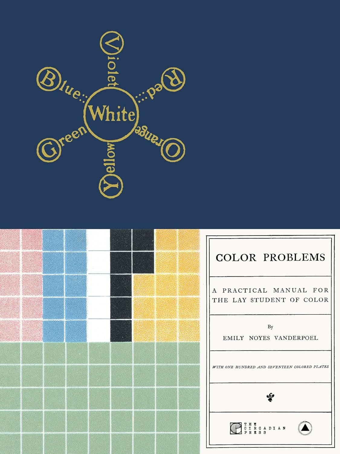
Color Problems: A Practical Manual for the Lay Student of Color
This is one of the most gifted books I’ve given to friends. Emily Noyes Vanderpoel (1842-1939) was a groundbreaking artist and scholar who anticipated midcentury design with her work "Color Problems: A Practical Manual for the Lay Student of Color." She creatively presented color theory within the context of flower painting and decorative arts, offering a unique and well-researched perspective on color.
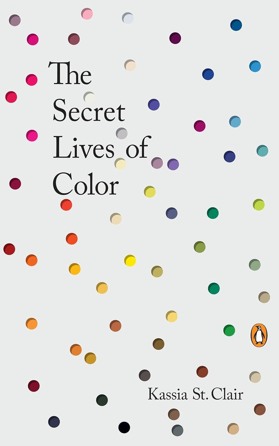
The Secret Lives of Color
Another one of my most gifted books. This is definitely a coffee table book you can pick up at any time. "The Secret Lives of Color" unveils the intriguing tales behind seventy-five unique shades, spanning from blonde to ginger, historically significant browns and whites, artistic epochs like Picasso's blue period, prehistoric cave charcoal, vibrant colors like acid yellow and kelly green, and colors associated with historical figures like scarlet women and imperial purple, weaving these captivating stories through history's rich tapestry.
I’ve also found it really helped me when explaining how to describe color more creatively and effectively.

Full Spectrum: How the Science of Color Made Us Modern
I was blown away when reading this book by Author Adam Rodgers. He explains in an often humorous way the origins of colors on my planet in a balance of science and perception.
In "Full Spectrum," Rogers traces color's journey from ancient civilizations to the digital age, exploring our ancestors' use of color in caves, Silk Road merchants' trade in ceramics, textile artists' color mixing discoveries, and the modern era's corporate espionage and digital revolution, reshaping the world of color.

Color Study, a Manual for Teachers and Students
It's remarkable to think that this book was originally published before 1923. With just 80 pages, it served as an invaluable resource for teachers and students, presenting the most crucial color theories. Now over 100 years later the information is just as relevant as ever. It's a treasure trove kniowledge.

Nature's Palette: A Color Reference System from the Natural World
Another book that was orginally published long, long ago! 1821 to be precise. Nature's Palette" reinvigorates a remarkable volume for modern readers by adding new illustrations of animals, plants, and minerals referenced by Werner alongside each color swatch. This enhanced edition allows readers to connect colors like "tile red" to porcelain jasper or a cock bullfinch's breast and "Berlin blue" to sapphire or a Hepatica flower. The book also showcases various specimens through lavish feature pages, including taxidermy, eggs, shells, feathers, minerals, and butterflies, all cross-referenced to the core catalog. With contributions from leading natural history experts, over 1,000 color illustrations, and eight gatefolds, "Nature's Palette" is a must-have reference for visual artists, naturalists, and anyone fascinated by the world of color.
Seeing Time: How Colors Affect Your Body Clock
Our bodies have a built-in clock that keeps us on a 24-hour schedule. It relies on our eyes to sense the natural light and dark cycles in our environment. These special cells in our eyes not only detect the brightness of light but also its color. Researchers found that our body's clock pays attention to the colors of light, not just how bright it is, to make sure our internal time matches the time outside. This helps us stay awake during the day and sleep at night. The following points help us understand why Color and Light Wavelenths help us regulate our ‘body clock’.
1. Our Eyes and Light: Our eyes have different types of cells that sense light. We've got rods and cones in the outer part of our eye that help us see things, like colors and shapes. Inside the eye, there are some special cells called photosensitive retinal ganglion cells (pRGCs), and these use a pigment called melanopsin to sense light.
2. Light's Job: Light does two important jobs for us: it helps us see things visually (like the colors of a sunset), and it helps our body keep track of time. This internal clock is called the circadian clock, and it helps us know when it's time to be awake and when it's time to sleep.
3. Not Just One Job for Light: For a long time, people thought that melanopsin was the main player in telling our body's clock what time it is. But recent research is showing that other parts of our eyes also play a role. It's not just about how bright the light is; it's also about the colors or wavelengths of light.
4. Different Photoreceptors, Different Jobs: Our eyes have different photoreceptors, each sensitive to certain colors of light. Rods like green light (around 498 nm), melanopsin prefers blue light (around 480 nm), and cones come in two types, with one liking UV light and the other green light (around 360 nm and 508 nm respectively). This means that our body's clock can tell time not just by how bright the light is, but also by what colors it sees.
5. A Role for Color: The study by Walmsley and his team looked at how the colors of light change during sunrise and sunset. They found that as the sun moves below the horizon, we see more short-wavelength (blue and UV) light. This color change in the light might help our body's clock predict when the sun will rise or set, which is important for keeping our daily rhythm in sync.
In simpler terms, our eyes have different cells that can sense light and colors. Light does more than just help us see; it also helps our body keep track of time. While we thought one type of cell in our eyes was responsible for this, new research shows that different cells in our eyes, which like different colors of light, work together to help our body's clock. The colors of light in the sky at sunrise and sunset might be like a clue for our internal clock, helping it know when it's morning or evening.
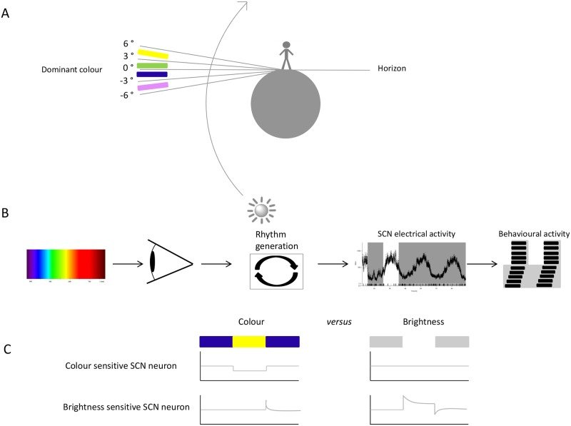
Image credit: Hester van Diepen.
Top 5 Photography Books from British Photographers
As a young lad growing up in England, I found myself inexorably drawn to the works of some of the most influential photographers that have graced the British landscape. The artistry with which they captured the subtle interplay of tones and colors, and their ability to expertly frame their subjects, was nothing short of awe-inspiring. It is my great pleasure to present to you now my personal list of the Top 5 Photography Books authored by British photographers, whose works continue to leave an indelible mark on the art of photography even to this day.
Please note that some of the links on this site are affiliate links, which means I may receive a commission if you purchase a product through the link. Rest assured, I only recommend products I have personally used or thoroughly researched. Thank you for supporting my blog!
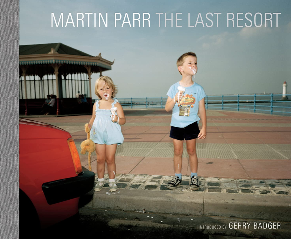
Martin Parr - The Last Resort
Martin Parr is a British documentary photographer known for his satirical and colorful images of modern life and consumer culture. His work often focuses on capturing the eccentricities and humor of everyday life and has been exhibited in galleries and museums around the world.

Terry O’Neill
Terry O'Neill was a British photographer known for his iconic portraits of celebrities and musicians. He captured some of the most famous faces of the 1960s and 1970s, including Frank Sinatra, The Beatles, and Audrey Hepburn.
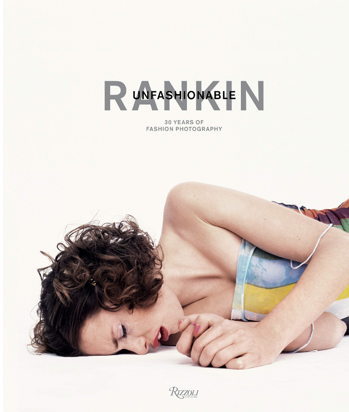
Rankin
Rankin is a British photographer known for his eclectic style and provocative imagery. He has photographed celebrities, models, and musicians, and his work has been featured in numerous magazines, including Vogue and GQ. Rankin is also a filmmaker and has directed music videos and commercials. He continues to be an influential figure in the world of fashion and photography.

Chris Killip
Chris Killip was a British photographer known for his black-and-white documentary images that captured the working-class communities of Northern England during the 1970s and 1980s. His photographs often focused on the struggles and hardships of everyday life, and he had a particular interest in the impact of deindustrialization on these communities. His work has been widely exhibited and published and is considered a significant contribution to the history of British photography.

Tim Walker
Tim Walker is a British fashion photographer known for his fantastical and whimsical images that often blend elements of surrealism and fairy tales. His work has been featured in numerous high-profile publications, including Vogue and W Magazine, and has been exhibited in galleries and museums around the world. He is also a filmmaker and has directed several short films and music videos. Walker's unique style has made him one of the most influential photographers in the fashion industry.
Joaquín Sorolla
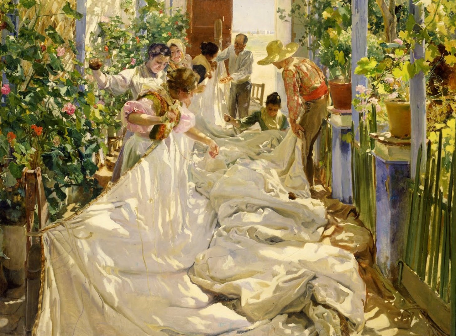
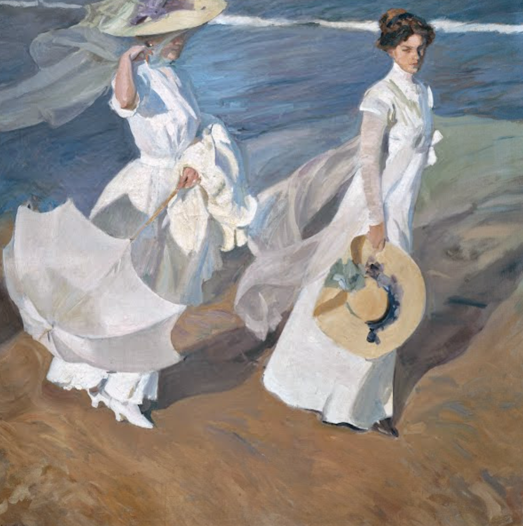
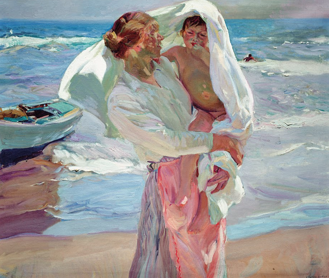
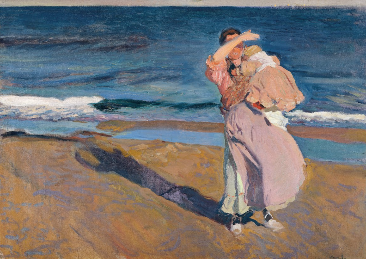
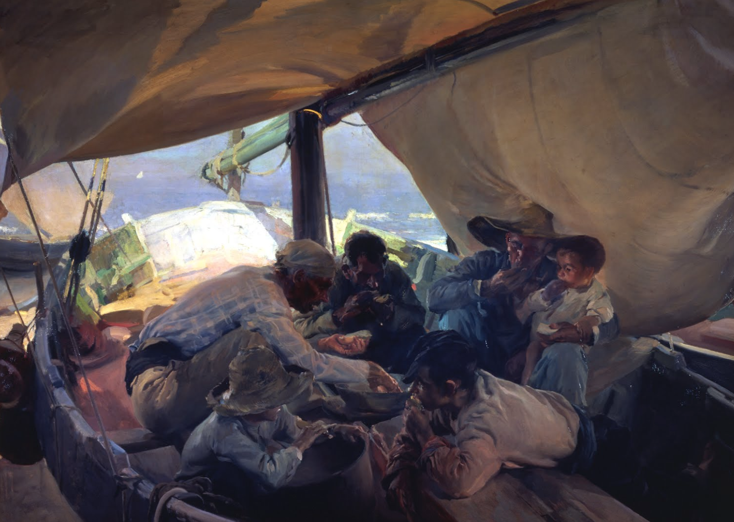
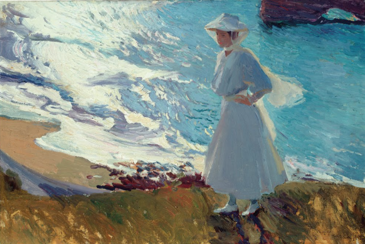
Joaquín Sorolla (1863-1923) was a Spanish painter known for his vibrant, light-filled depictions of landscapes, seascapes, and people. He was particularly renowned for his paintings of beaches and scenes of everyday life in his native Valencia, as well as his portraits of Spanish royalty and other prominent figures of his time.
Sorolla's style was characterized by his use of bright colors and loose brushwork, which conveyed a sense of movement and vitality. He was heavily influenced by Impressionism and was considered one of the leading Spanish Impressionist painters of his time.
Sorolla received numerous awards and accolades during his career, including a gold medal at the Universal Exposition in Paris in 1900. Today, his works are held in collections around the world, including the Museo Sorolla in Madrid, which was his former home and studio.
LA Fitness - Make A New Day Resolution

I really enjoyed grading this up for LA Fitness. I wanted to use a fresh color palette that helps add to the vibrant energy of the spot. The combination of bright and bold hues really makes the visuals pop and adds a sense of depth and dimensionality to the overall look.
https://lnkd.in/gQhHG_a9
Director - Christian Breslauer
DP - Cory Waters
Agency - The Woo Agency
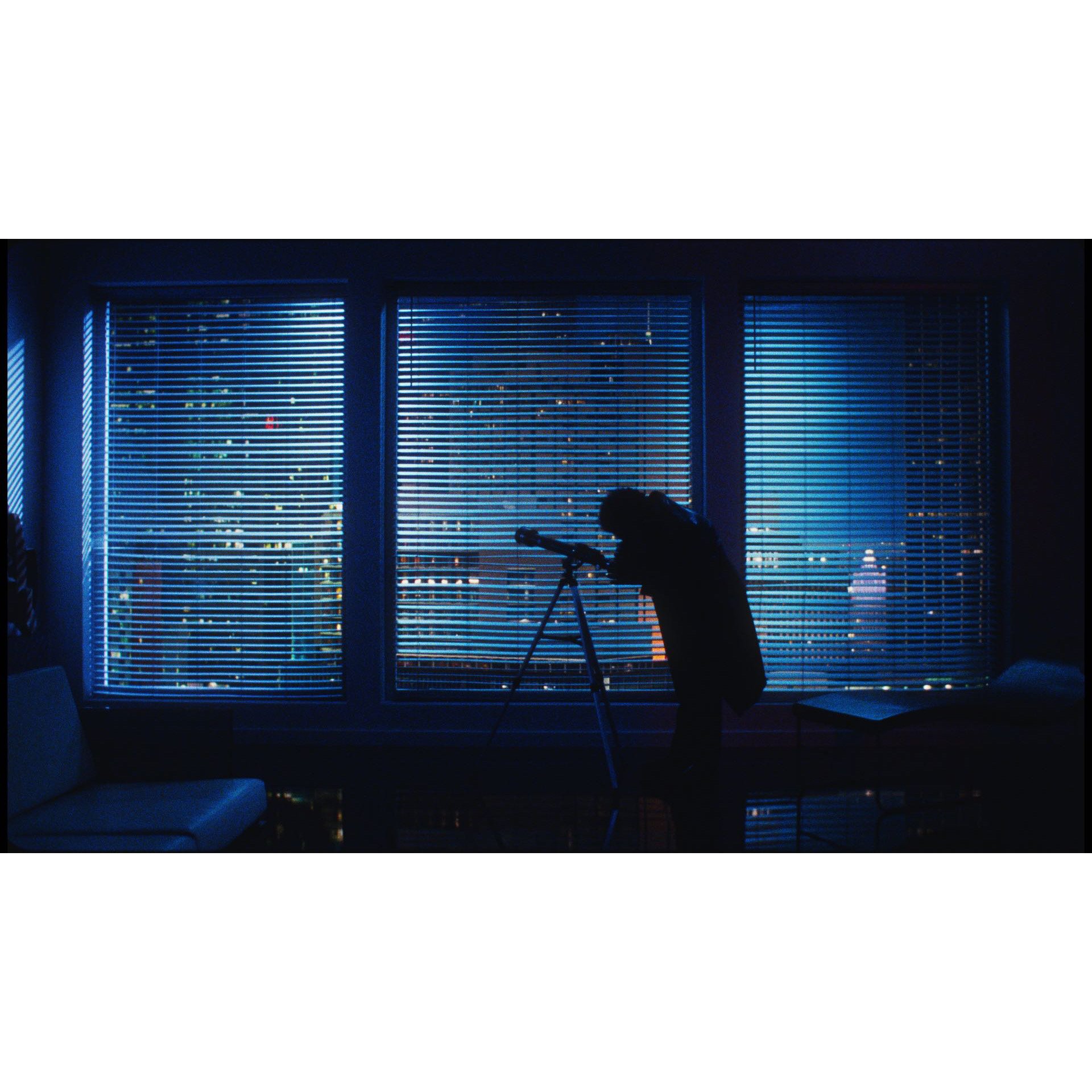
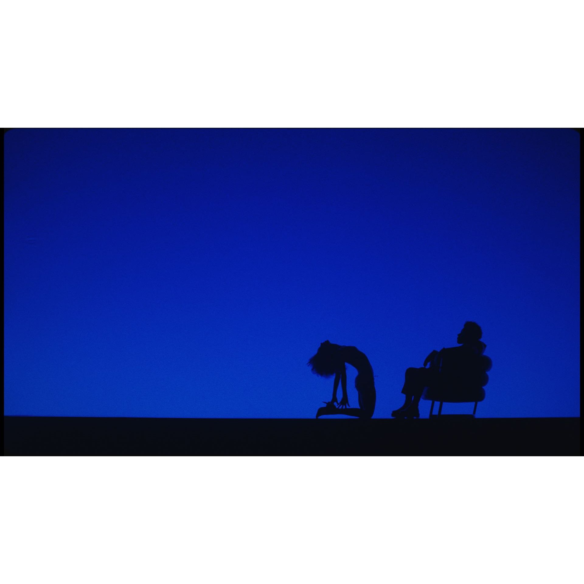
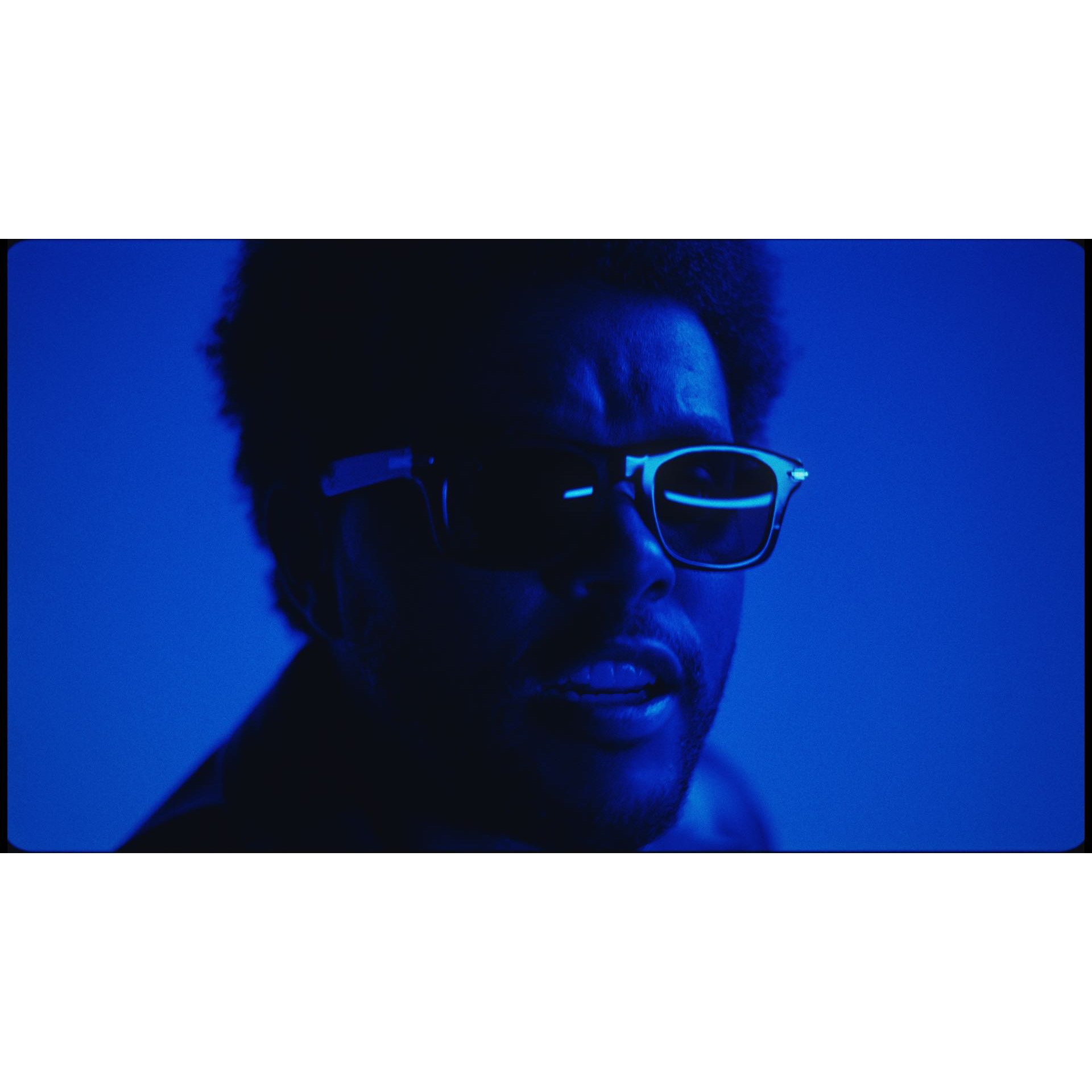
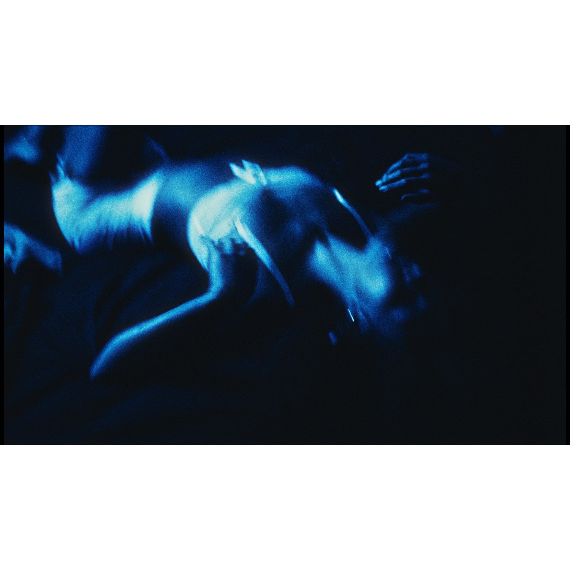
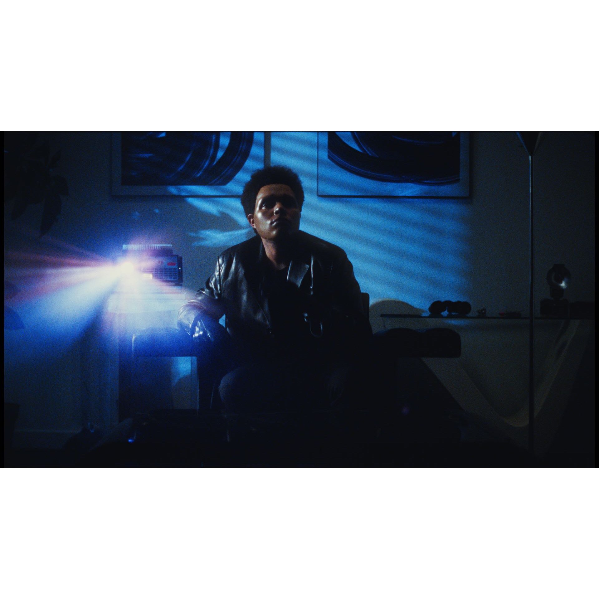
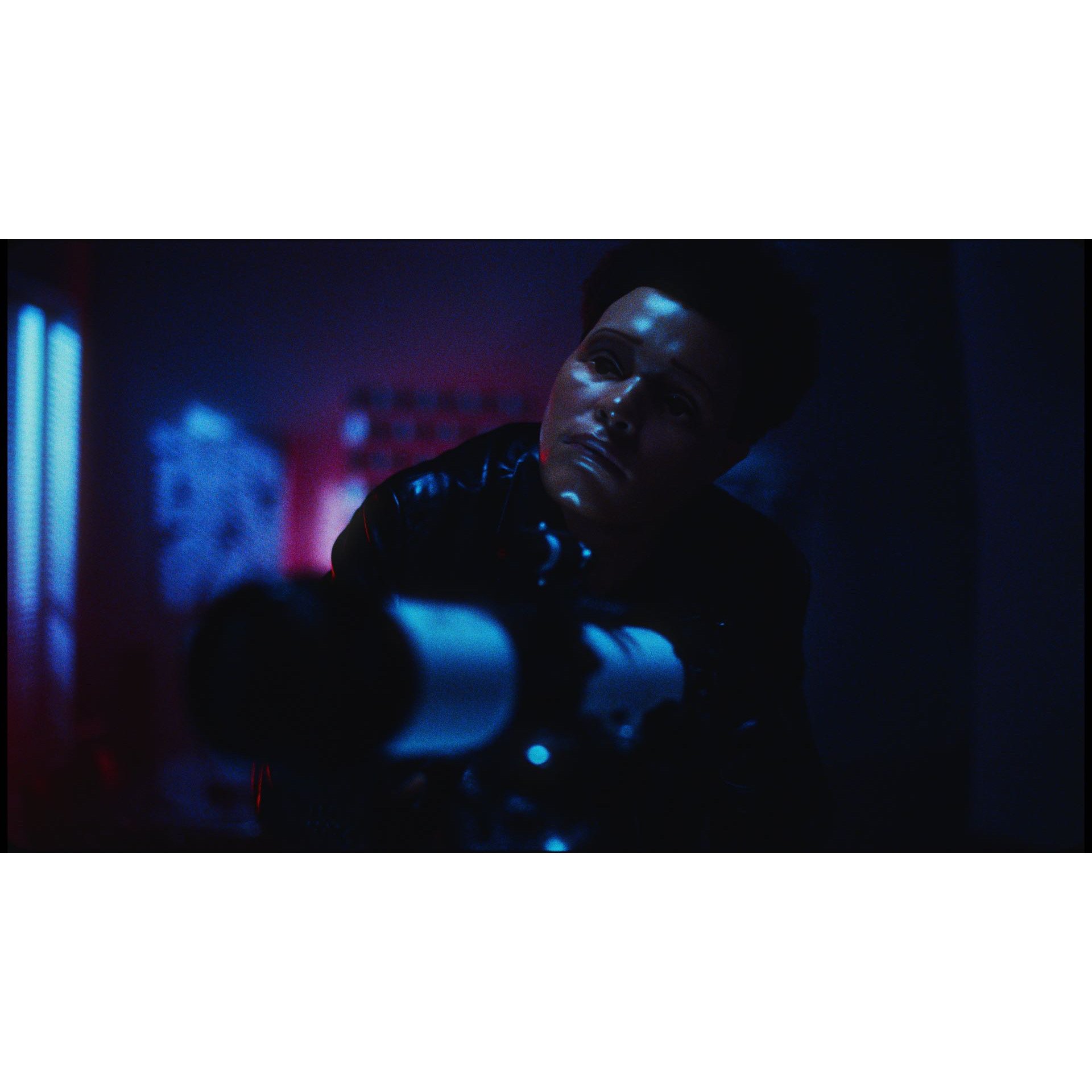
The Weeknd - Is There Someone Else?
Just before the holiday break I graded up a really nice 35mm project for The Weeknd. Directed by Cliqua and shot by Nick Bupp.
Just after it was shot I started having discussions with the Nick about the look of the feel of the film. References of ‘A Body Double’, ‘Rear WIndow’ and ‘Dressed To Kill’ were all talked about. We really wanted to stay away from Cyan blues in the apartment scenes and go more Navy/Cobalt to reference the 80’s vibe. It was super creative to the go for a bleached bypassed cyan look in the flash photography scene, with these awesome hot white in the highlights.
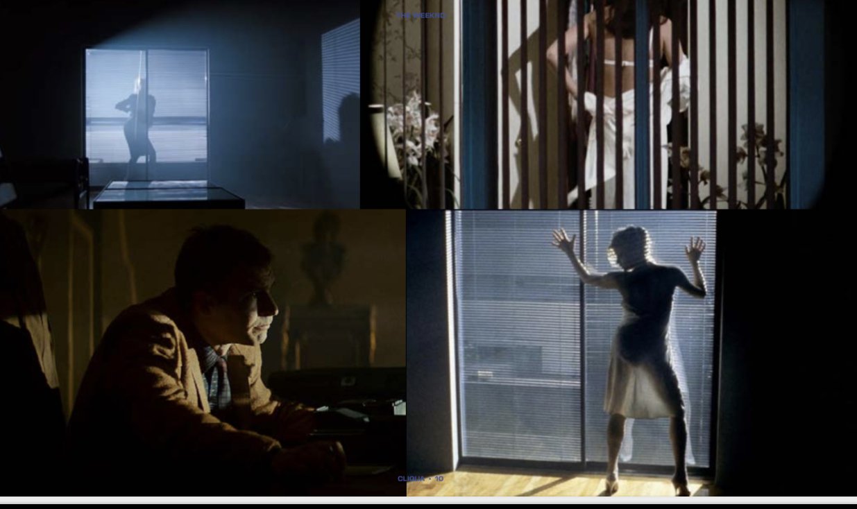
We wanted to stay true to the natural filmic qualities 35mm organically has but add a little extra contrast pop to make it feel a touch more unique.

Fresco Painting
A really beautiful on to grade up for Yanbal - Connect With Your Skin.
I had just returned from vacation in Italy and was so inspired but seeing Michelangelo’s Sistine Chapel Ceiling. I’m no Michelangelo, but I was so impressed how his fresco techniques allowed the characters to almost look like they were reaching out to you, almost jumping out of the ceiling. I experimented with some of his techniques in this grade.
Made by my friends Director Alexis Gomez and DP Leo Calzoni
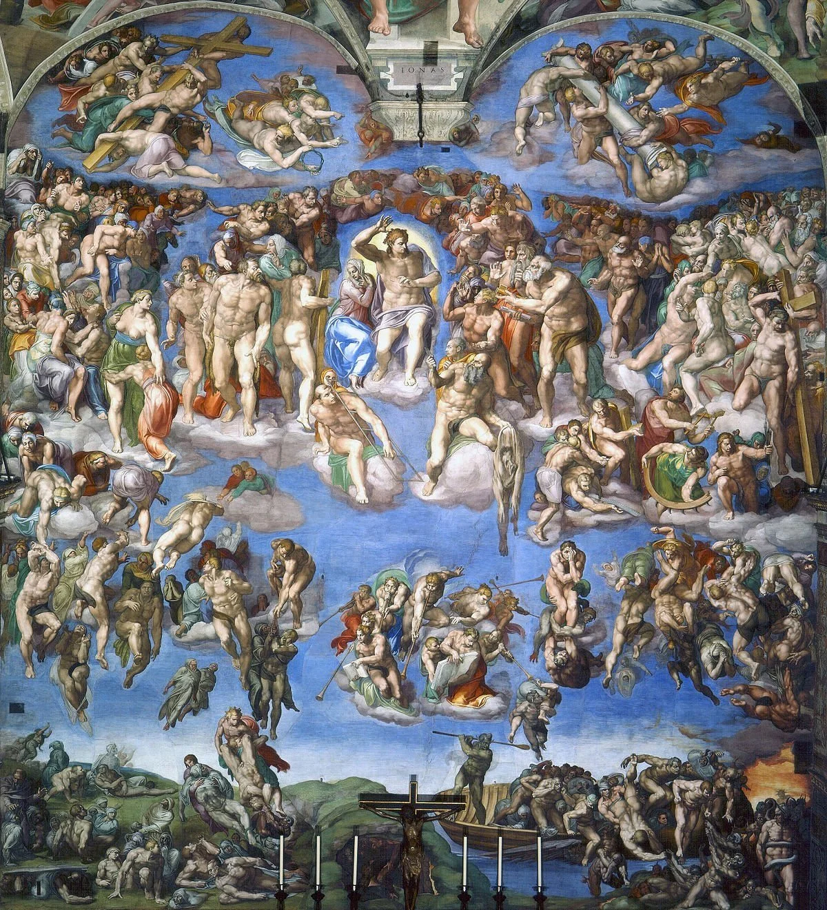
The Sistine Chapel ceiling (Italian: Soffitto della Cappella Sistina), painted in fresco by Michelangelo between 1508 and 1512
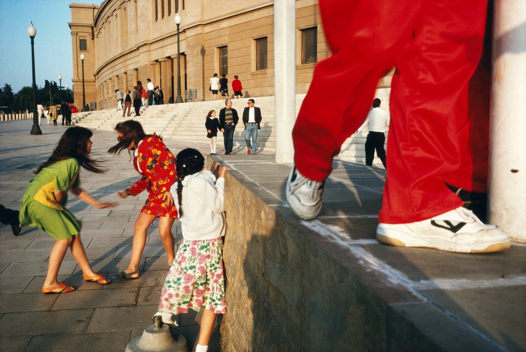
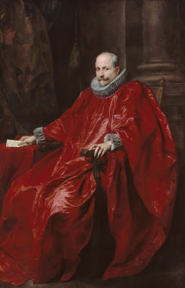
The Effects Of The Color Red
Red is the most dominate, striking, powerful and passionate color in the entire spectrum. The more I research about color the more I come to realize how emotive the color is in our minds.
The University of Rochester discovered that when you see the color red their reactions become faster and more forceful.
The color reds effect is deeply routed in our DNA. It’s almost a primitive thing. For example when you blush, your face turns red. It’s also been proven that the first color an infant sees is Red. So it’s hardwired into our brains. I believe it’s a color that is easily recognizable. It has the longest wavelength (380nm) which is also why its the top color on the rainbow.
So whether your ‘seeing red’ or ‘rolling out the ‘red carpet’ know that the color Red demands attention and is to be noticed.