Greenland 2: Migration Color Palette
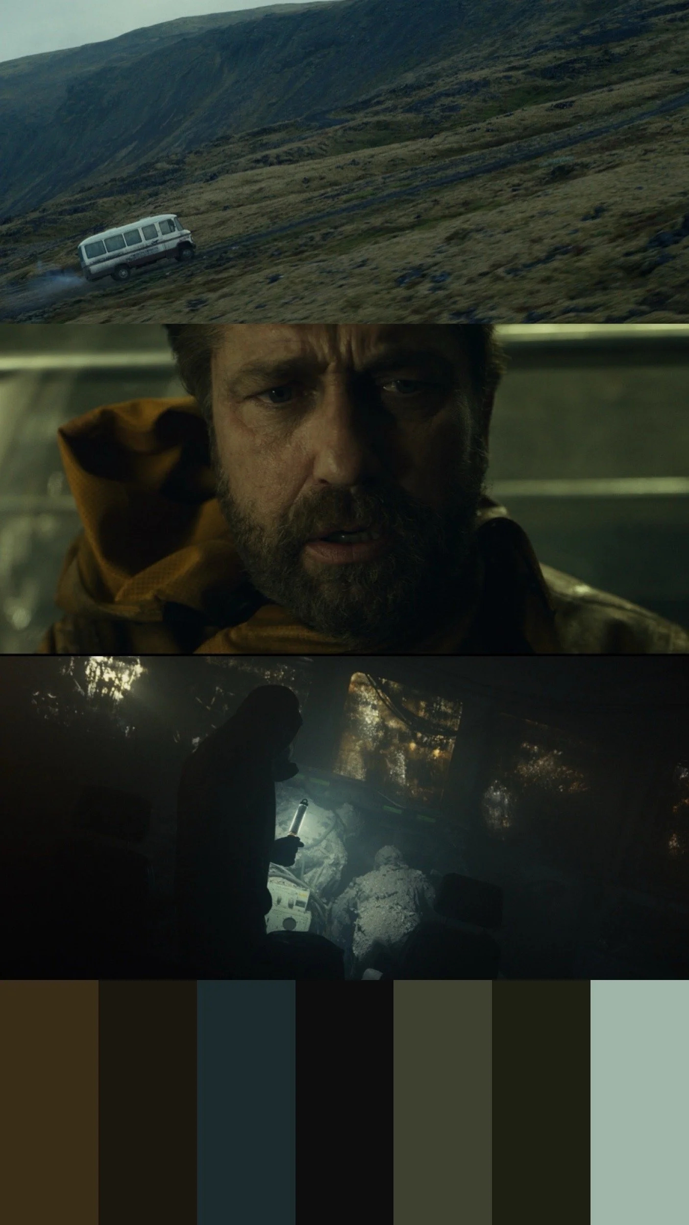
When we approached the color of Greenland 2, the goal was never sepia or “apocalypse orange.”We wanted the palette to feel earthy, but unsettled.Familiar colors, soil, stone, skin slightly skewed and restrained, so the world feels recognizable… but not quite safe.As the story progresses, color is slowly fed back into the image slowly tracking a return to life.That’s how color works best: Not announcing itself, just changing how you feel.